Designs
Logo Series

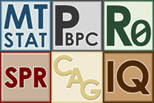
When JT4 began updating their in-house software, I insisted we make a series of scalable logos with a consistent theme. Up to this point the software developer chose the logo for the software. Different developers chose different styles through a series of different methods. There was no continuity even between versions of the same software. They now have a clean, consistent, professional look which tells the user it is an in-house product. The impetus to use the software was increased by the colorful series of shortcuts placed either in the toolbar, in the start menu, or on the desktop.
Elisabeth Font

Over the years I've had several people ask me about my handwriting. They see it on my whiteboard and ask who wrote it. I laugh and say, "Me. It's my whiteboard." The usual response is then, "Where did you learn to write like that?" Nuns.
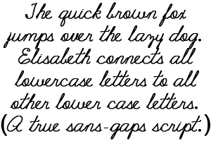
But it did get me thinking about capturing that old style "Palmer Method" of handwriting. Since handwriting is no longer taught in schools, I decided to create my own font; Elisabeth. The font captures the continuous flow of the lowercase letters resulting in a script with no gaps within words.
Custom Icons

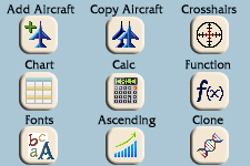
After convincing our team at JT4 that branding was important, even for in-house software, they easily agreed that our GUIs desperately needed an update. Button icons that were easily understood had never been a priority. Now they would be. We needed some unique images for the home-grown software including aircraft buttons. Each icon was created in both 24x24px and 16x16px, using the same color palette as the logos. In this way, the buttons also became part of the branding. They are now used across several different programs and decrease the learning curve for new analysts.
